

Aigenis Invest
The first mobile investment platform in Belarus – trading currencies, bonds and stocks on the national exchange straight from a phone
My Role
About Product

About
A product that ran on people, not on a system
The product was running, but it ran on people rather than on a system. iOS and Android behaved like two different apps, there was no design system and no specs, and decisions were made in chat threads and lost in the same threads. Two years went into turning that into a product that could take growth
The work
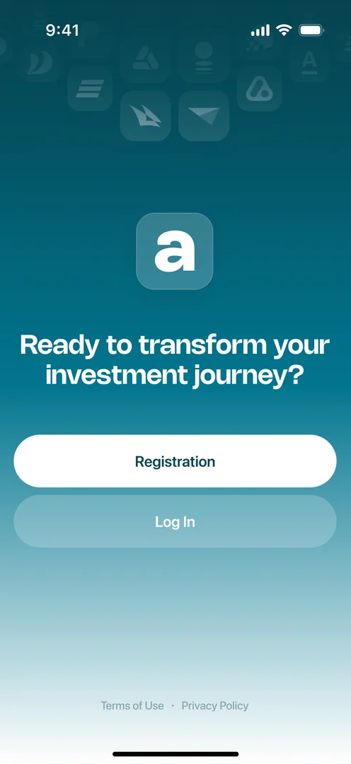
Sign-upI started with the most expensive hole: 38% made it through. That isn’t a form problem, it’s a trust problem – you hand over your passport and your money without knowing what happens next or why. We broke the process into steps that explain themselves, made the purpose of each one visible, and began recovering the people who still dropped out mid-way through a lead-capture form. 38% → 75–80%, plus 15% of abandoned sign-ups recovered
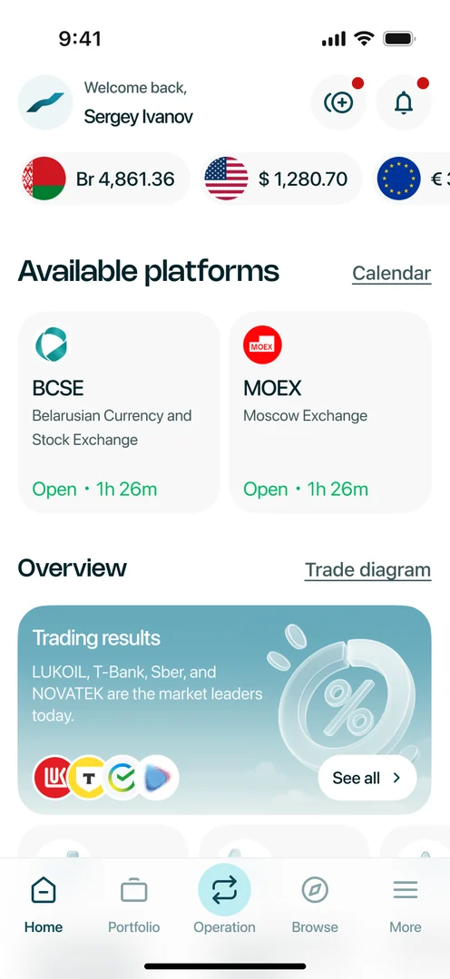
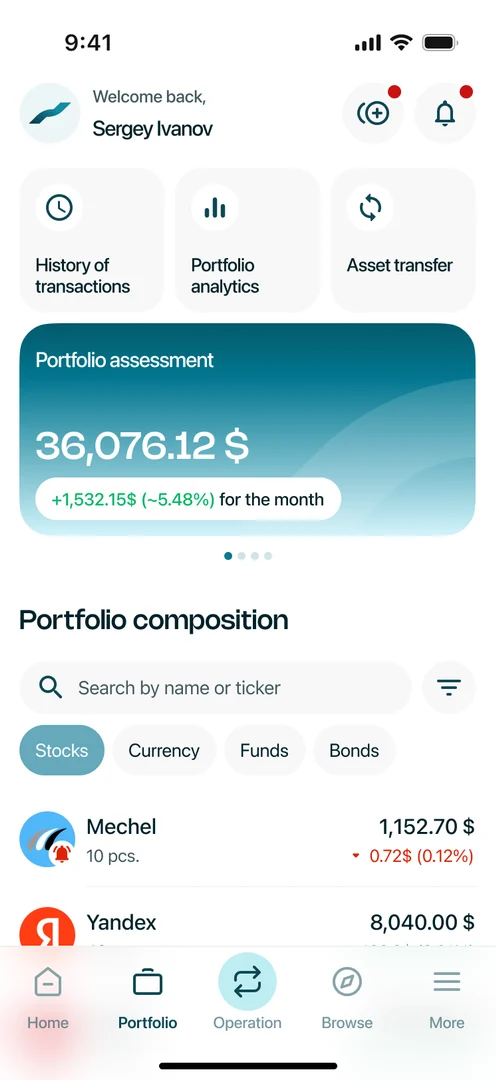
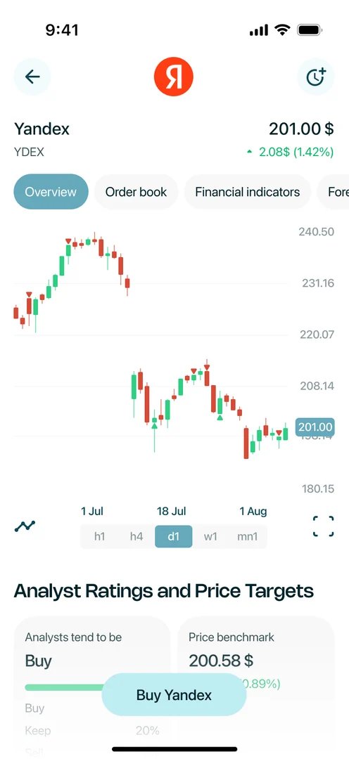
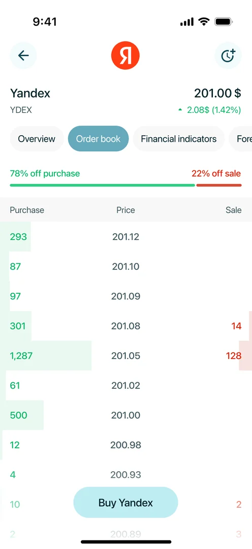
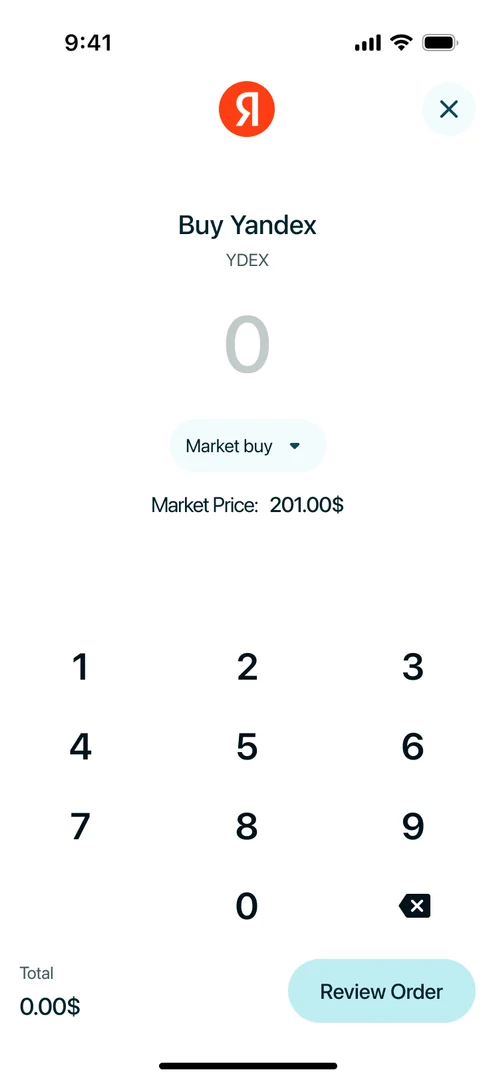
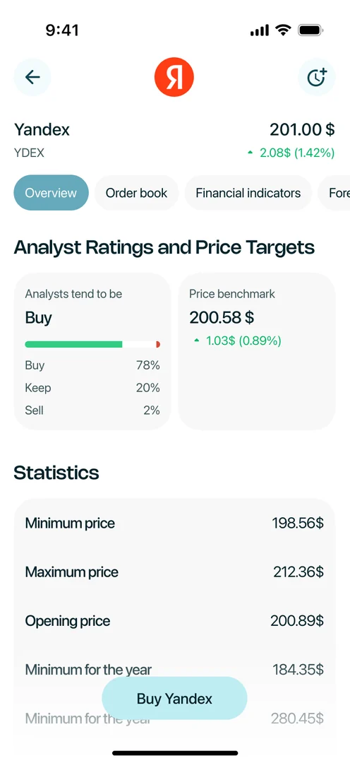
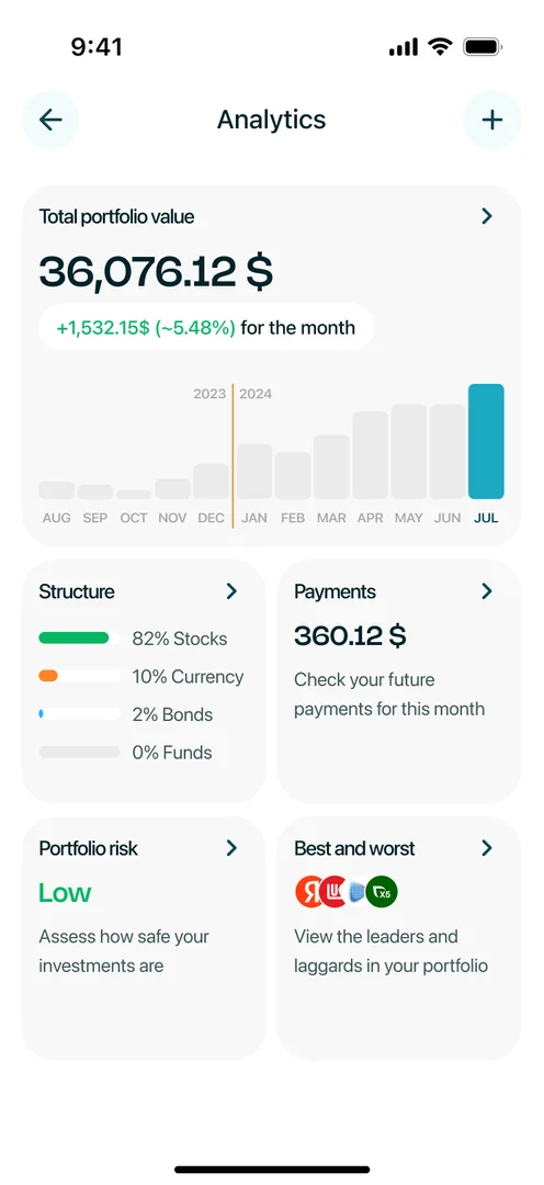
Rebrand and a new UIMarketing shipped a new brand, and I used it as the reason to rewrite the interface rather than repaint it. That’s when I built the design system from scratch and brought iOS and Android to the same behaviour: as long as the platforms solved the same problem differently, every change cost two implementations and two bugs. Design ↔ dev velocity doubled
UX debtRebuilding the UI surfaced the real issue – it was never about looks. The app’s logic contradicted itself in more than twenty critical places. We went at it iteratively rather than as one big redesign, prioritising on two things: what an error costs the user, and how much support volume it generates. Support requests −40% – the interface started explaining what people had been explaining by hand
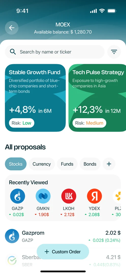
New features and a second exchangeThe final year was new functionality, the largest piece being the MOEX integration. Not a feature bolted on top: the product had been designed around a single venue, and adding a second one meant rebuilding it so the exchange stopped being hardcoded and became pluggable – different instruments, different trading sessions, different rules, one coherent experience for the user
Team
Led 4 designers: split ownership, ran reviews, kept the system consistent across platforms, and made the product calls when there was no one else to make them
Results
8,000 → 26,000 users
Sign-up conversion 38% → 75–80%
Support requests: 250 per month → ~20 per month
Design ↔ dev velocity x2
~50+ critical UX issues closed
